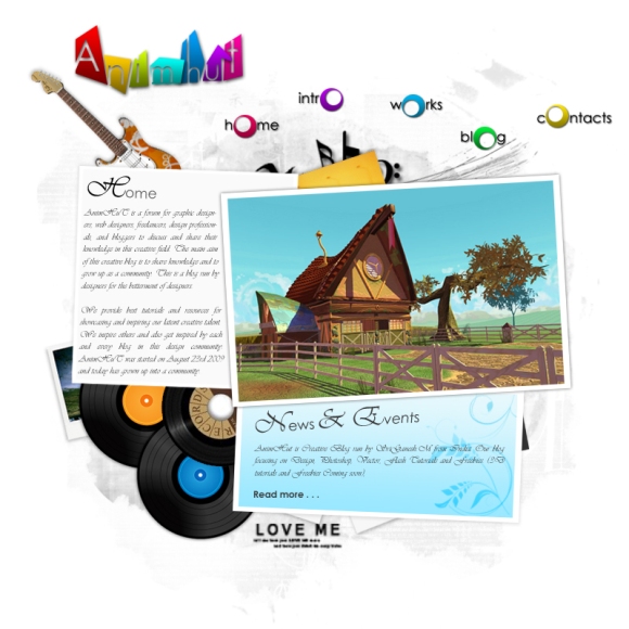
Hi and hello to everyone. Today we are going to see how to create a music studio website. This website is really easy to create and most of the work is done by brushes and some pngs itself. Though it may be long, but still it is very easy. It took hardly 45 mins to complete this template for me.
Preview
Preparation
- Grunge brushes
- Floral brushes
- Music brushes
- Text brushes
- Polaroid pngs
- Record pngs
- Guitar pngs
Step 1
Open a new document of size 800 px X 800 px with a white background.
Step 2
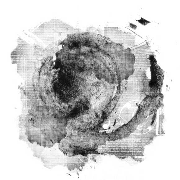
Now press D to make foreground and background colors default. Now load the grunge brushes and apply them on a new layer like this. Apply each brush on each layer.
Step 3
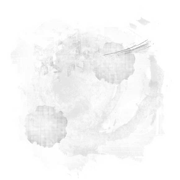
Then reduce the fill of the entire brushes layer to 10% to 25% as you wish. Then you must get something like this.
Step 4
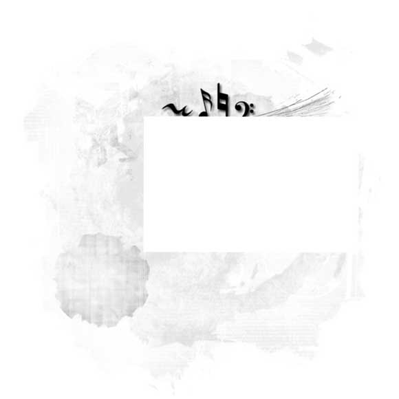
Now load the music brushes and apply them here and there on the canvas. Then apply drop shadow layer style to it with its default settings.
Step 5
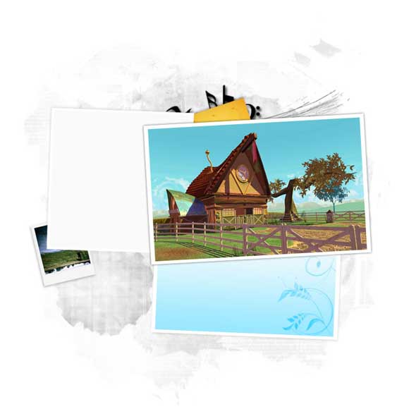
Now make a white color rectangle like this.
Step 6
Now apply black color outer glow to that rectangle with the following settings.
- Opacity: 30%
- Spread: 2
- Size: 5
- Blending mode: Normal
Step 7
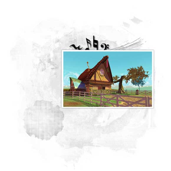
Now place a picture inside that rectangle of the same aspect ratio. But a little bit smaller than this rectangle.
Step 8
Now select these two layers together and group them by pressing ctrl+g. Then press ctrl+t and rotate it slightly in counter-clockwise direction.
Step 9
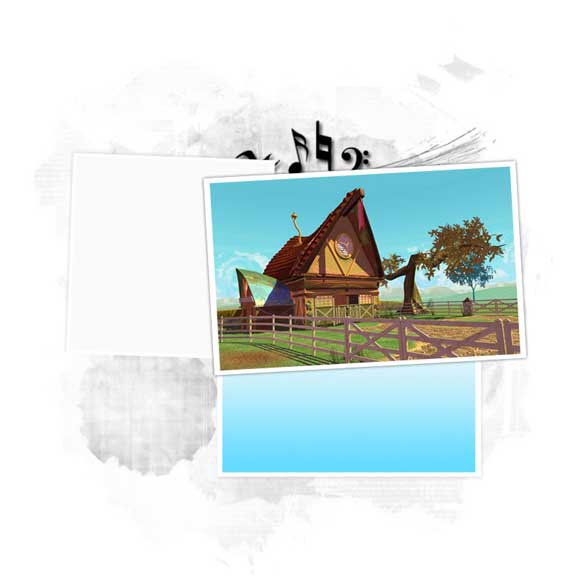
Now create one more square like this and give it a color overlay with the following settings.
- Color: fafafa
Step 10
Now take a copy of that layer. Expand it slightly and place it behind the light grey square layer and remove give it the following layer styles with the specified settings.
- Color Overlay:-
- Color: ffffff
- Drop shadow:-
- Color: Black
- Blending mode: Multiply
- Opacity: 12%
- Angle: -60
- Distance: 2
- Size: 5
Leave the rest with the default values.
Step 11
Then select both the layers together and rotate them slightly in clockwise direction and group them also. More importantly place this group below the previous group created.
Step 12
Now create a white color rectangle like this and apply drop shadow layer style for this with the following settings.
- Color: Black
- Blending mode: Multiply
- Opacity: 60%
- Angle: 120
- Size: 2
- Spread: 5
Step 13
Now create one smaller rectangle than the white rectangle and apply gradient color to it. The gradient color settings are as follows.
- Light blue on top: d8f3fb
- Brighter blue at bottom: 63dbff
After applying it reduce the opacity to 65%.
Step 14
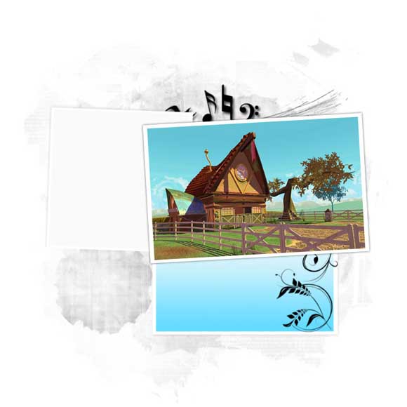
Now load some floral brushes and apply them in black color inside the blue gradient rectangle like this.
Step 15
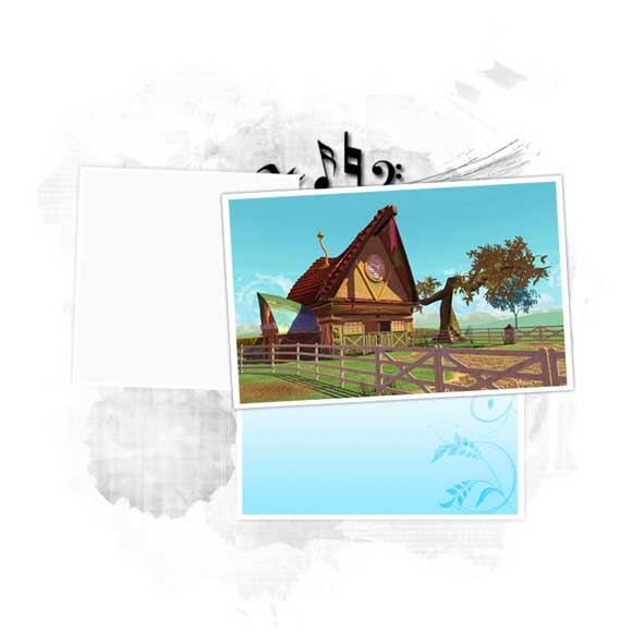
Now change the blending mode of all these floral brush layers to overlay.
Step 16
Now group the two rectangles and the floral brushes layer together and rotate them slightly in clockwise direction. Now place this group also below the main rectangle group that we created first.
Step 17
Now take two Polaroid pngs and place them here and there with drop shadow layer style with the same settings that we applied in Step 12 but reduce the opacity alone to 30%. Also place them below the rectangle layers.
Step 18
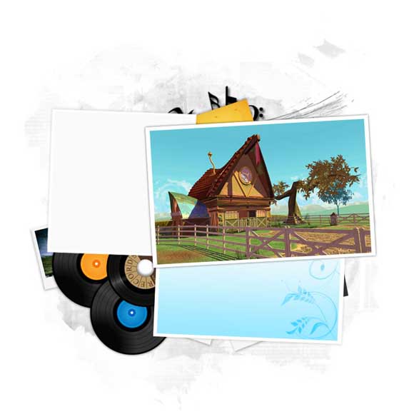
Now place some records like this.
Step 19
Now create some more light and dark grey colored rectangles in different layers and apply drop shadow layer style with the same settings that we have applied in Step 17. Group all these rectangle bits together and place them below the main rectangles layer.
Step 20
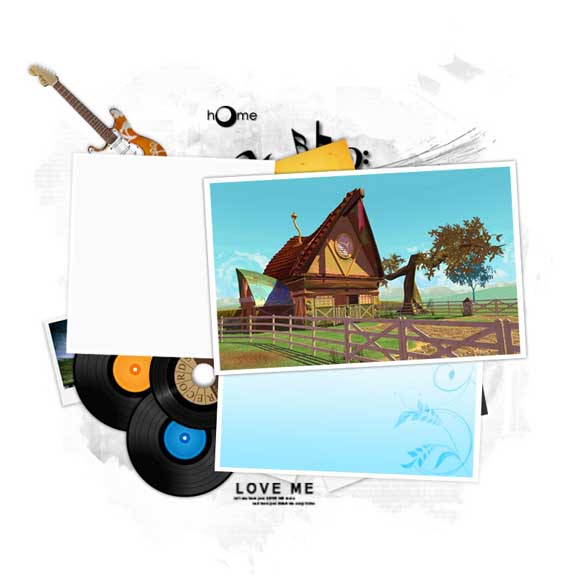
Now take the guitar png and place it in this fashion.
Step 21
Load the text brushes and apply some text brush like this.
Step 22
Now take some thin font and type “h me” in black color with some drop shadow effect and repeat the settings from Step 17.
Step 23
Take the elliptical marquee tool and select a small circular area. Now take the same elliptical marquee tool and choose the “subtract from selection” option and deselect a particular area from it and fill it with any color you want and place it in between h and m in home.
Step 24
Now apply any type of gradient overlay you want and choose your own gradient colors with some drop shadow effect.
Step 25
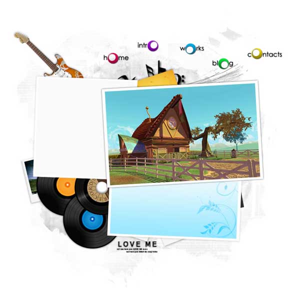
Now repeat the same for other links also but apply different gradient overlays and the area you are deselecting also shall keep changing and place them randomly here and there on the canvas.
Step 26
Now create a different shape of your choice with gradient overlay of your choice and drop shadow layer style. Now type only A. Now place the “A” above that shape. Hold ctrl+click inside the thumbnail of the “A” layer now delete the “A” layer and then select the differently shaped object layer and press delete. This is what you get now.
Step 27
Repeat the same for other letters also.
Step 28
Now type the remaining texts for the web template in this fashion which is easy and doesn’t requires more explanation.
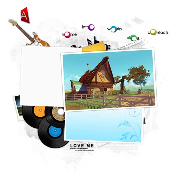
This is how your final output looks.












very nice. i like the end result. i also like your new header
Hi Diana, Thanks for your comments. I hope that you like the last step unlike the previous post lol!!
Great Tutorial!! I am Surly going to try this!!
Thank you Karthik. I am sure you can produce different results if you try some experimentation with this.
wow sooooooooooooo good man, its so simple colourful
Thank you karthik.
Photoshop kadavule, neenge valgzha
I am photoshop kadavul. I am photoshop demon. Adobe devil’s fvourite demon.
Thanks for the tutorial. I will try this. %-)
Ji, Its easy tuts you can finish it under an hour.
very interesting layout! thanks for this tut
Nikola, happy about your comeback. Thank you.
Great tutorial. I love the outcome of this tutorial its a great layout.
Thank you marcell. Your profile pic is really good. I really like it.
Nice layout. Thanks!
Thanks for the appreciation Lam
nice tutorials…
thanks….very helpful…..
Hi crunchy, Thanks for your comments. Its boosts me write more tuts like this.
This is a really nice design.. I’m so impressed.. You make it look so easy… loveit.
Thank you Pam. I think you are a new visitor to our blog. Welcome to our blog.
thats beautiful and interesting layouts
Thank you Elvis Parkinson. I have more interesting layouts surely i will post them also. Your avatar looks good. I like these kind of grunge devilish things.
Very nice Sipi! love the end result, and also very easy to follow along with as well 🙂
Thank you lee. I am happy about your comments
Excellent tutorial and the final outcome is great, really inspirational music studio website!
superb tutorial…
thanks…..
Thank you crunchy
Converting this into html is really very easy and doesn’t requires any tut. hihi
This is a really nice template and i love the step by step guide, this makes it really easy to follow and to make sure you are doing it correct and can learn properly.
Thanks for sharing this tutorial.
Nice design tips that help us much !
Amazing guidelines, I am not expert in PS but I would love to make sample like this one. I really wanted to learn this. Thanks for sharing the guidelines and tips. You amazed me.
Wow.. Really nice tutorial.. I gonna try this..:)
really professional website design tutorial for music lovers.