Today’s Photoshop Tutorial on Graphic and webdesign blog is “60’s Retro style poster design” by Kate, a new author to our blog. Welcome Kate Manhaven.
You can write Tutorials, Contribute with Freebies or Roundup Inspiration post which should be beneficial for our readers.
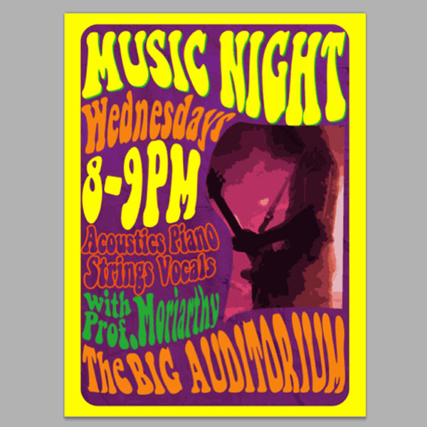
If you want a 60’s themed poster with all the distinct font, color and graphic effects reminiscent of that era then this guide is what you need. I will show you how you can design a retro poster design infused with authentic 60’s style. Read on and enjoy.
Photoshop Tutorial Details:
1. Photoshop any format time : less then 30 min
Step 1
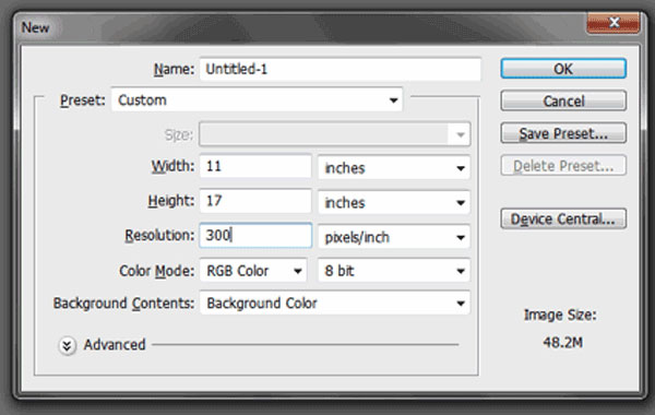
First, let us setup a new document for our poster. There really are no strict dimensions for your posters, but if you like to create a standard advertising poster, you can go with a simple 11×17 inch poster dimension. Use 300ppi for resolution as this helps maintain a good quality for printing posters.
Step 2
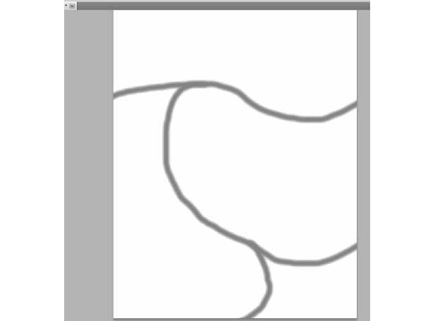
To help you out with the warped type text in 60’s posters, you will want to create a few guide lines or brushes. In our example, we just used a light brush to add the guidelines like so. These guides will help you shape where the text will be warped as well as the image.
Step 3
Now, create a new layer by pressing CTRL+SHIFT+N. Name this Background. Then fill this up with a Purple color, or any kind of color that fits your theme. Reduce its opacity to 60% for now.
Step 4
Next, create a new layer again by pressing CTRL+Shift+N. Then, use the rounded rectangle tool to inscribe a rounded rectangle in the center of your poster, this will define the border. Color it any color for now. Use a 50px Radius for the rounded edges of the rectangle.
Step 5
Now, hold down the CTRL key and then click on the thumbnail image of this rounded rectangle. Afterwards, Press SHIF+CTRL+I to invert the selection. With our new layer selected earlier, fill this area with a yellow color.
Step 6
Then, delete our original rounded rectangle shape to reveal our yellow border inscribed in our new layer.
Step 7
Now, we shall be typing in some text titles. Just type in your text using the Text tool. Make sure of course to try to use vintage 60’s or 70’s fonts to “get into” the era. Then on the layers panel, convert the text to shape by right clicking on the text layer and choosing “Convert to shape”.
Step 8
Once you have your title set, press CTRL+T to begin transforming the text. With the selection box for the transformation active, right click and select “Warp”. Then warp your text to shape with the guides you created earlier.
Step 9
Then, just repeat the process for all the text that you want in your poster. In our example, we have rearranged the guides so that we have more text details for the poster. Once done, increase the opacity of our purple “background” layer back to 100%.
Step 10
Next, we add some color variations and layer styles. First we changed the colors of several of the text to orange like so.
Step 11
Next for the other text we use a layer style. In this example, we double clicked on the layer for “Acoustics Piano etc…” and then selected a 5px orange color stroke as its effect. Then we reduced the fill of this text to 0%.
Step 12
Next, we changed the color of the professor layer to a green color to make it stand out a bit.
Step 13
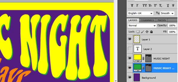
Finally, select our original title layer. Press CTRL+J to duplicate it. Then shift the position of the duplicate under the original layer. Change its color to green and then nudge its position twice downwards and twice to the right using the arrow keys. This gives us this color effect here:
Step 14
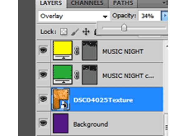
Once done, paste in a nice paper texture over our background. Afterwards, change its blend mode to overlay and reduce its opacity to 34%.
Step 15
Once done you should have something like this.
Step 16
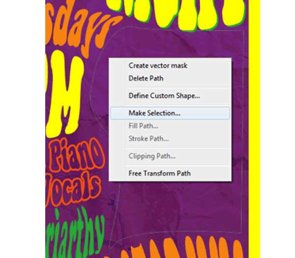
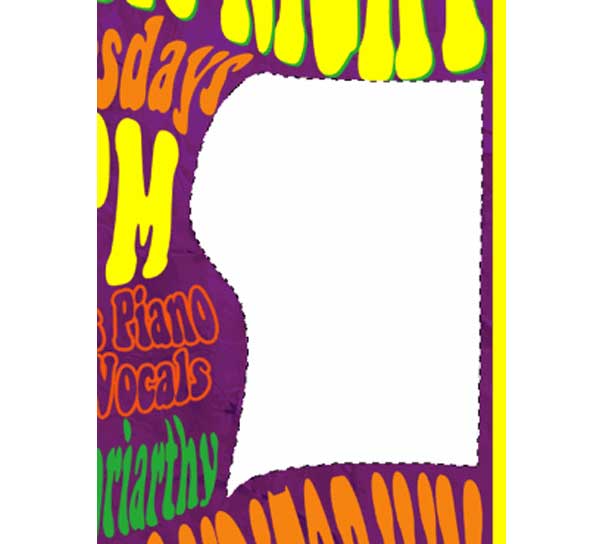
Now, using the pen tool, create a shape that matches the empty area that we have. Right click on the path and then select the option “Make Selection.”
Step 17
Then create a new layer by pressing CTRL+SHIFT+N. Fill this new layer with a white color for now.
Step 18
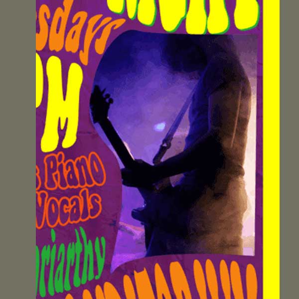
Next, paste in a picture for your poster. Then right click on it and select create clipping mask to append our picture to the new shape layer.
Step 19
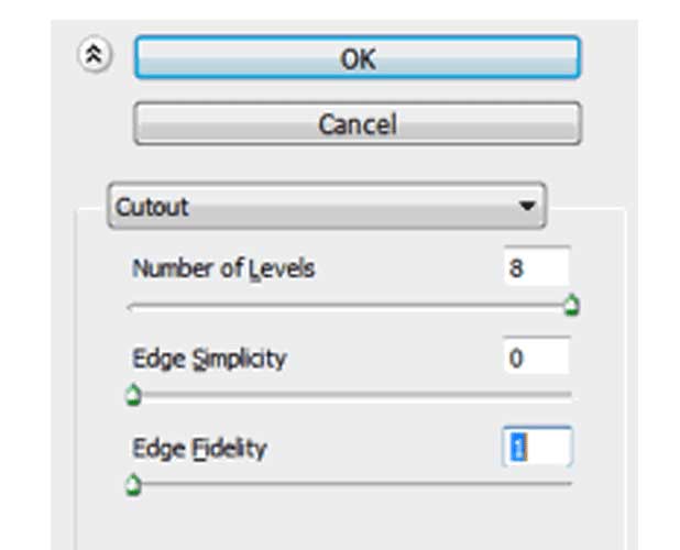
Next, go to Filter –> Artistic -> Cutout. Then apply the following settings:
a. Number of Levels: 8
b. Edge Simplicity: 0
c. Edge Fidelity: 1
Step 20
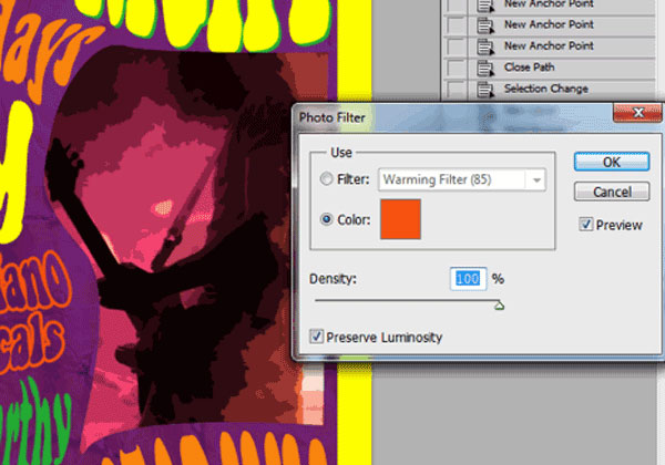
Next, go to Image -> Adjustments -> Photo Filter and use a 100% orange photo filter for our image.
Step 21
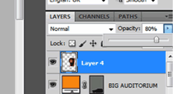
Finally, merge our image layer and the shape white later and then reduce its opacity to 80%.
Step 22
The result is a nice retro style poster perfect for your “vintage” type themes. Congratulations!
Author Bio
Kate Manhaven is a graphic artist who works with print place, an online printing company that offers business cards, postcard printing and poster printing services. She spends her free time either wake boarding or snowboarding whenever the season permits.

