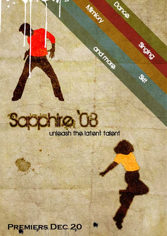
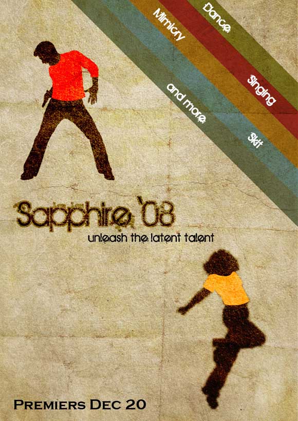
Graffiti and retro styles are really fascinating styles in design field from the day of their introduction particularly because of their eye-catching colors and attractiveness. They always make things look very eccentric but still good. So now in this tutorial we are going to see how to create a graffiti retro style poster.
Preview
[xyz-ihs snippet=”Backfill”]
Step 1
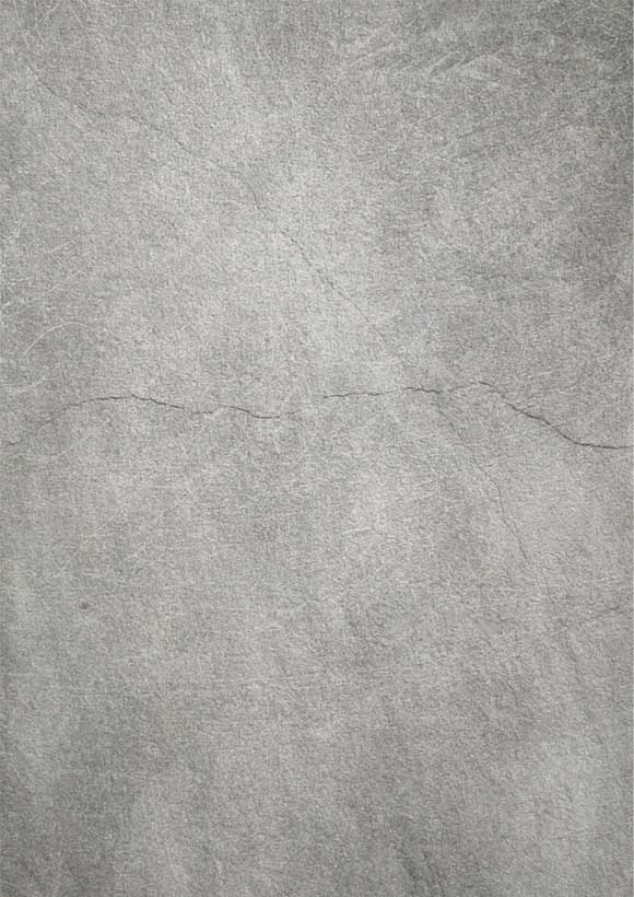
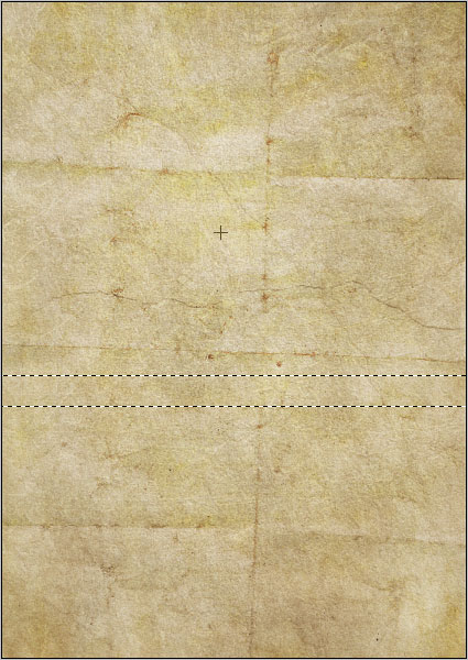
First open a file of A3 or A4 size with 300 ppi and in portrait mode. Now place this texture on a new layer.
Step 2
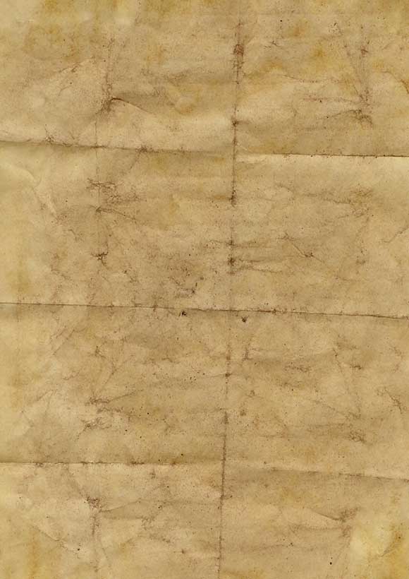
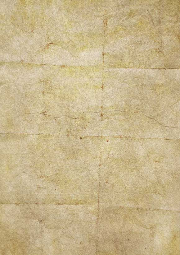
Now add this texture above this texture and change blending mode to hard light, opacity 85% and fill 90%. And you will get the following output.
Step 3
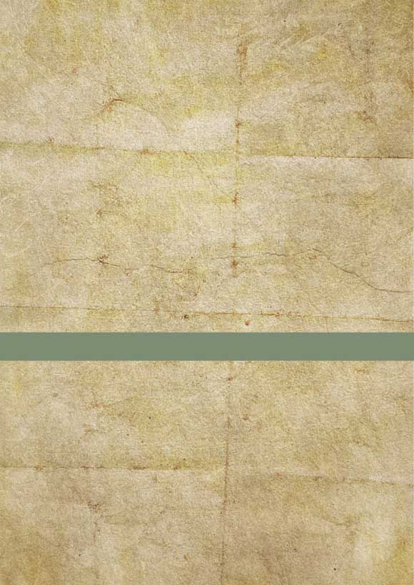
Now make a rectangular selection like the following and fill it with color value “7d8d72”.
Step 4
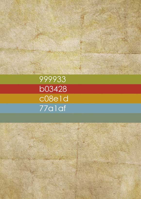
Now take 4 more copies of that rectangle layer, place it vertically one above another and fill with the following colors as shown below.
Step 5
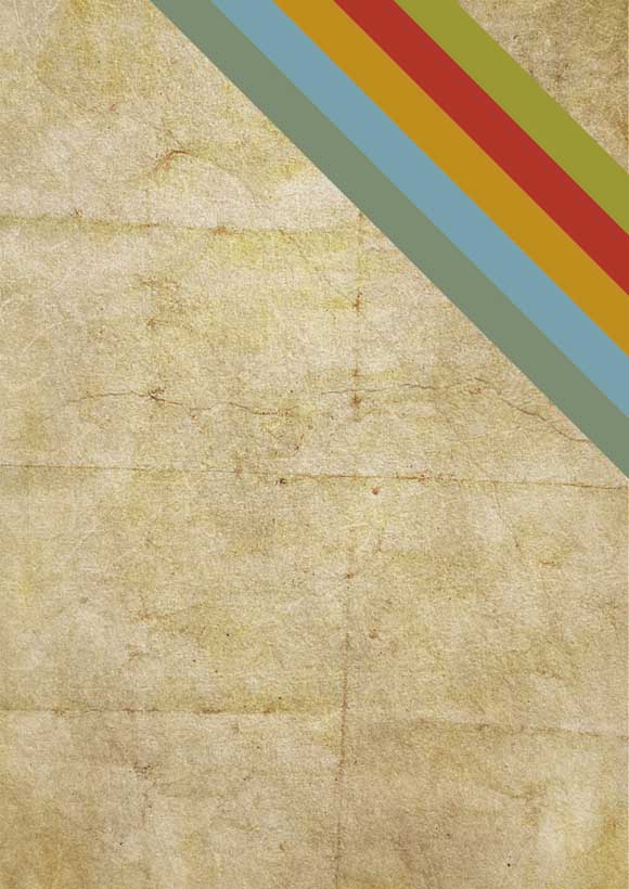
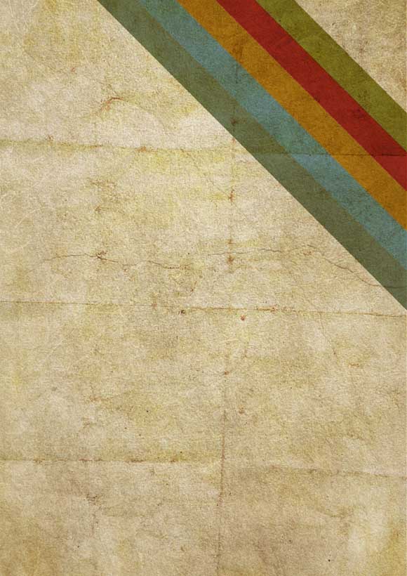
Now select all these rectangle layers together press ctrl+t and rotate 45 degree clock wise and place it in the top right corner in this fashion.
Step 6
Change the blending mode of the entire rectangle layer into multiply and you will get this type of output.
Step 7
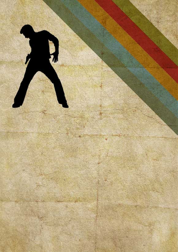
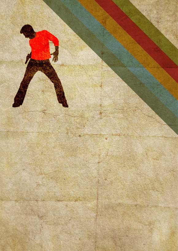
Now place a silhouette like this and make it completely black.
Step 8
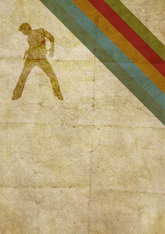
Change blending mode of the silhouette layer to overlay and you will get this kind of output.
Step 9
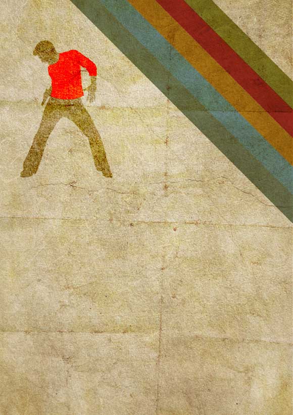
Now draw a red shirt for him by tracing around his body and the change its blending mode to overlay.
Step 10
Now take a copy of that silhouette layer and change its blending mode to overlay. Now hold ctrl and click inside the thumbnail of the red shirt layer and then press delete with the silhouette layer still selected. Then you will get this kind of output.
Step 11
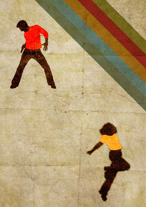
Now include another silhouette at the right bottom of the poster and follow the same steps as done for the previous silhouette (Step 7 to Step 10). But change the color of shirt for this silhouette. Now you must get something like this.
Step 12
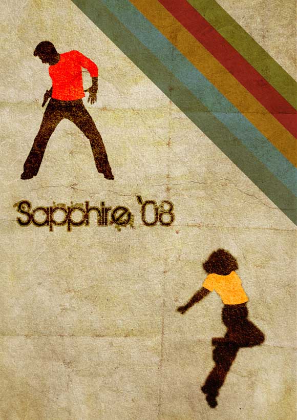
Now include the name of the event in black color and change blending mode overlay. Now hold ctrl and click inside the thumbnail of the text layer. Now the text gets selected. Now create a new layer below the text layer. Then go to Select-> Modify -> Expand and expand the selection by 2 to 5 pixels as you desire and fill it with black color and change that layer’s blending mode also to overlay.
Step 13
Now include other texts in the following manner as I have shown in the poster.
Step 14
Now include some splatter brushes here and there but not all over or with too much of colors and also try changing those layers blending mode to produce better output.
Thus, this is how you will have to create this poster.



Nice tut:) Congrats. I like retro & oldschool graffiti style.
Thanks adone, thanks for your appreciation, and interest in our blog
Oh really nice tutorial!! Enjoyed every step 🙂
thank you suraj, thanks for the comments and regular visits.
thank you for the tutorial. It can be followed very easy, and the explanations and screenshots are very helpful. Great way to improve the technique.
thank you flyer templates this was made 2 years back and i was afraid whether i will get good reputation now and i am happy that it has gathered some attention.
Retro style will never get out of style…
Simple but great tutorial for beginners
Thanks Sipi:)
Yeah tutorials are for beginners not for professionals because they already know nook and corner of the software.
Might chance my hand at this tutorial it looks so simple and easy to pull off!
u r really doing awesome . i wish u the best of luck:]
I’m really interested in trying this tutorial…is there a website where I can find the textured backgrounds that you used?
This is a really cool tutorial! Thanks for sharing. I got a lot of good skills from this.