Business card is a great way to express their brand and especially every designer or client must have. The clients always look out the professionalism in you and later the cost, like that! The way you make your business card will stand out from the crowd. To make biz cards we have to follow very few guidelines, and apart from that not stick to the same fact or style. Its creative means you can show creative in your own way, i fed up with the default white card with your name and your details and nothing else- it really frustrating. Even some companies follow or say stick to their fact- funny!
Today we are going to create a simple business card with texture applying on it. As i always shout “break the rules”. But the basic guidelines should be kept for printing and user-friendly to the print media and client.
[xyz-ihs snippet=”728″]
Basic Requirements! :
1. Company name (optional).
2. Your name.
3. Your title.(status)[ graphic design, illustrator.. etc]
4. Phone number (mobile number in case you are freelancer).
5. Your e-mail address (never use a free service) but most of them don’t have own site/domain email
6. mailing address(optional) [ i won’t do that ]
Tutorial :
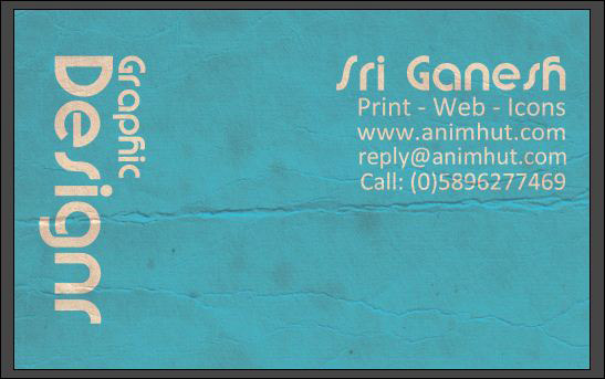
Final Output:
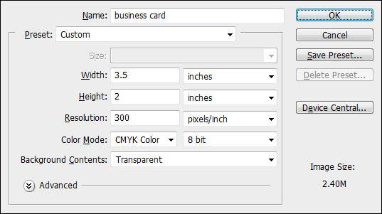
Step:1 Create a document in Photoshop and give these settings
– Mode: CYMK (for printing)
– Width: 3.5 inches X height : 2 inches
– Resolution : 300 ( for better quality )
Create a document in Photoshop
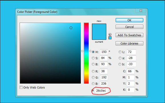
Now pick the Foreground color #26c0ec and hit enter. Press Alt +backspace for fill foreground color.
File the color with #26c0ec
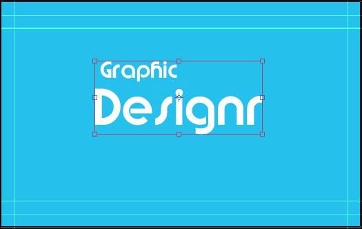
Step:2 Make Guidelines
Here we made two line horizontally and vertically, the reason we won’t add much detail here. So keep the text at the equal distance I made this two lines.
[xyz-ihs snippet=”720″]
make a rough guidelines
Step:3 Add the Text
We are using Brandish Font here ! (See their licences use before commercial purpose). Link: Brandish Font
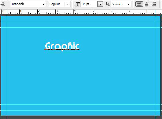
Type the word graphic
Type the Word “Graphic “@ 14” font size. Now press Ctrl + T for transformation and right click on the text and select Rotate 90 degree CW.
Do the same for Text for “ Designr ” Font size= 30”. Do the transformation as we did earlier.
type the word graphic and Ctrl+T
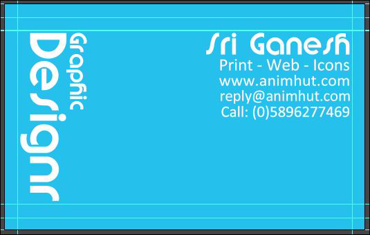
After Rotating the both text lace it in the left corner of the card. But it should not exceed above the guide line.
Step:4 Add basic details to the business card.
In the right side, type your name. With the brandish font. And below that add the following details in Calibri font.
Print-web-icon
your site name/company site name
your email address
Contact number
Note: i used the brandish font for my name to highlight them. Other basic details are in 11-12 size and it’s optional.
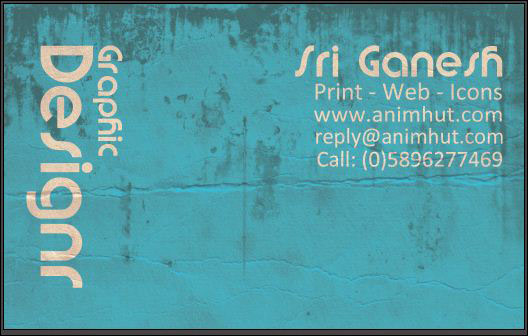
Step: 5 Add texture to the business card
We have writer we used paper texture from SXC.hu- i usually get textures from there. See the standard restrictions on the image.
Download link: . Now open the image in Photoshop and copy to our business card psd, above all the layer.
Now change the layer mode to MULTIPLY and opacity = 83% and fill = 42%.
Note: as we mention you always play with the layer mode and you get more unique effect
Final Output:
Optional Steps
[xyz-ihs snippet=”backfill”]
1.Adding any grunge brushes to the biz card make unique and dirty effect on it.
2. Use halftone brush download
Without texture
Your print ready business card done.
We like to hear from you. How this tutorial and the result came. Please give us feedback even if it is negative one. That makes us to improve more and give back quality content to design community









Quick and easy, nice outcome! Thanks for the tut 🙂
.-= Nikola Lazarevic´s latest blog ..20 Astonishing Monochromatic Web Designs =-.
Thanks for the comment Nikola, this is my first biz card, i try to give more quality in next time
NIce tuto 🙂 Keep it up
.-= SmashingWebs.com´s latest blog ..10 Free WordPress Themes: April Package =-.
thanks thomson
Nice tutorial Sri, although I like the without texture result more then the grunge effect.
.-= Thomas Craig Consulting´s latest blog ..40 High-Quality Free Fonts For Your Designs =-.
yes it is! i just tried new !my 2 friends using this biz cards now
Nice work Shri, I loved this easy tutorial. Keep it up.
Waiting for next. 🙂
.-= suraj´s latest blog ..20 amazing Earth wallpapers on behalf of Earth Day 2010 =-.
thanks for the comment – we will sure post some new tutorials on biz cards
I liked the all the optional steps dude 🙂 🙂
Very quick and easy tutorial 🙂
Thanks 🙂
.-= Sunil Jain´s latest blog ..[How to] Free IPL Facebook Theme =-.
thanks sunil
Nice font and effect. Congrats Bro. 🙂 Cheers
.-= adone´s latest blog ..Kiedy (nie)klikam w reklamy? =-.
i do like the fonts for this biz card. sir
Great tutorial! Thanks! 🙂
.-= Cardview´s latest blog ..Lush Business Card =-.
thanks for the comment. welcome to animhut
That is really a simple tuto. Thanks bro!
Buddy, I request you to keep a “hire me” page.. 😉 Excellent works! ^_^
.-= S.Pradeep Kumar´s latest blog ..4 WordPress Plugins You Should Try Today =-.
Simple and neat one. The last one looks great.
Nice work.. Well done.. Now ill try dis.. Thanks 4 giving nice design
Simple and cool tutorial
awesome.yay iam new to photosop..im loving it..learnt a new thing today
This is great. It really looks like a beaten down business card. I thought it was a photo at first.
Very nice tutorial, I create some extra cards with them on my site, thanks
.-= FreshBusinessCards´s latest blog ..30 Unique Business Cards =-.
Thanks for the Word. FBC
Mobile website design is quickly becoming the next big thing.
the steps is easy to understood, thanks for the tutorial
Excellent article. Indeed, The halftone brush is an exceptional.