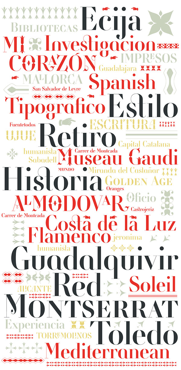
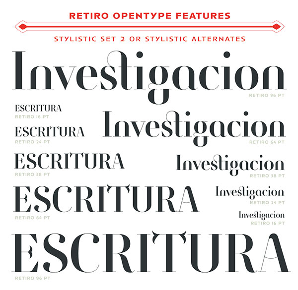
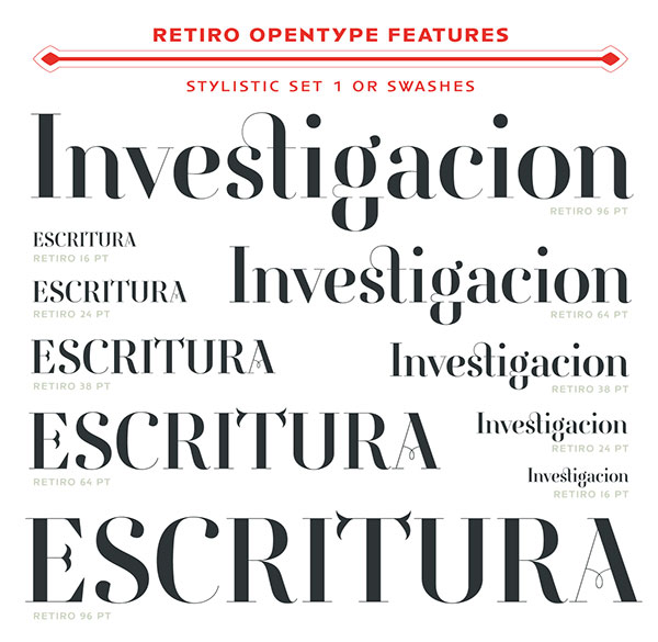
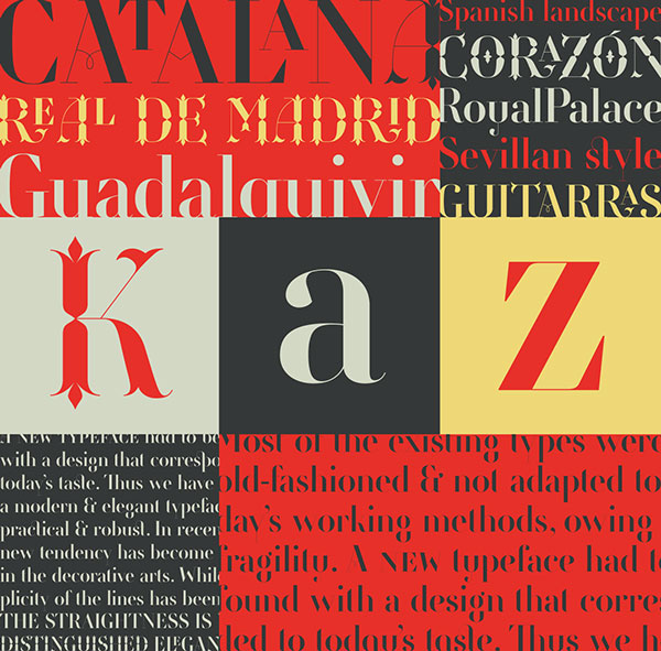
For today’s inspiration, we are featuring one of the new popular OpenType Font which is a premium font collections. Retiro was made during 2006, for a magazine with more 1100 glyphs. Retiro designed by Jean François Porchez is exclusively available at Typofonderie, in a unique weight in 5 optical sizes. Over the years, the team that worked on the Retiro has included Mathieu Réguer and Lucie Alvado. More than 1100 glyphs, including extended languages support, 4 sets of figures, various set of capitals, lowercases, superiors, ligatures, alternates, swashes, titling variants, stylistic sets, contextual alternates and ornaments.
Retiro is a daring interpretation of Spanish typography. Severe, austere and yet, full of life, Retiro is a vernacular version of Castilian and Andalusian in a typical Didot. Named after a lovely park in Madrid, Retiro started life as a a bespoke typeface designed to give a unique voice to the magazine Madriz. In 2006, the founder of Madriz was looking for a Didot for his new magazine. The Didot is the archetypal typeface used in high-end magazines. Retiro, based on Ambroise is a synthesis of these high contrast styles mixed with an Hispanic mind. Result is then, after 2-3 years of work, a typeface with countless variations – Retiro in 2009 included 470 glyphs – to establish typographic shades adapted to different sections and pages of the Madriz.
In 2014, it was necessary to further revise “the typeface before its launch at Typofonderie.
Retiro – New Premium Font
All the images are copyrighted to the respective owner.
Hope you like this article, kindly share this article in social media.


look infographic instead of blog. But best infographic.
best info graphic. i am also interested in this field.