Hi, viewers in today’s tutorial we are going to see how to create a jazzy style poster. The concept of this poster is promotion for a fashion designing company. Jazzy style was one of the rocking style in the early 70’s and was also in use only for a very few time. Jazzy style generally has a dark background with some lighter shades of bright colors on the foreground. So, using this concept I have designed this poster and let’s see how to create it.
Step 1
Open a document with a black background of A4 size and in landscape mode with 300 ppi resolution.
Step 2
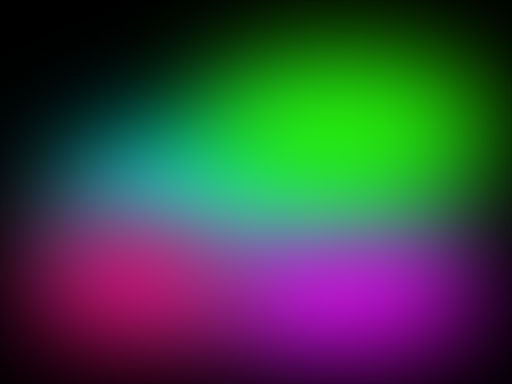
Now take soft round brush of big size and different colors and click it here and there like this. If you want you can even change transform the brush as you like.
Step 3
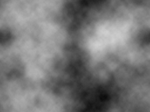
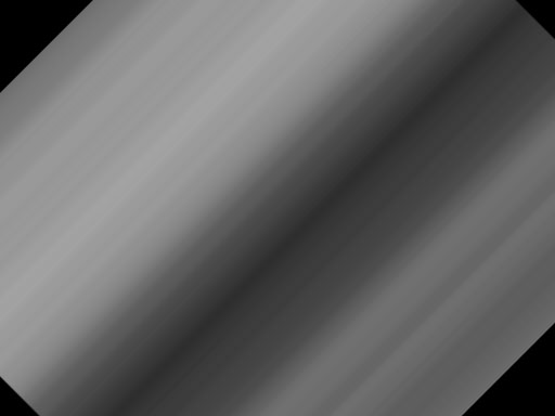
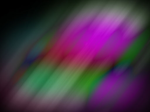
Now create a new layer and set foreground and background layer to black and white respectively. Go to Filters->Render->Clouds. Then go to Filter ->blur->motion blur. Set values to 90 degree angle and distance as 999. Then press ctrl+t to transform and rotate it 45 degree in clockwise direction.
Step 4
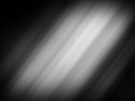
Click on the add vector mask thumbnail available at the bottom of the layers palette second from left. Now select a soft round brush and brush it such that there are no sharp edges left and that layer has an irregular shape with feathered edges like this.
Step 5
Now change blending mode to anything you like and I have change it to difference, because all blending modes have produced pleasing effects for me and this is the output you will get.
Step 6
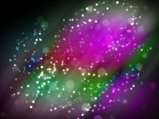
Now download some bokeh brushes and click it here and there in different layers with different sizes in white color. Then change all those layers blending modes to overlay or soft light. I prefer and would recommend overlay.
Step 7
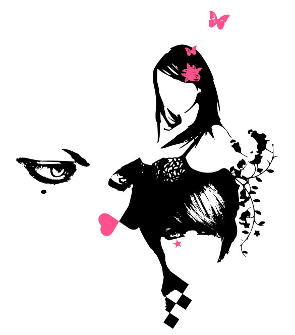
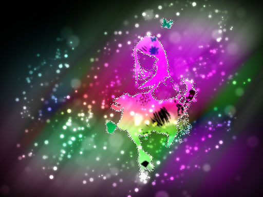
Now take an illustration like this or else take the same illustration even. Put it in the center. Using the magic wand tool select all the white portions and the eyes also and delete them. Now change this layers blending mode to overlay. Now apply outer glow in layer styles and make sure that the outer glow color is white and blending mode is dissolve.
Step 8
Now type the text you like in the place you like with white color and take a copy of it. Change both the layers blending mode to overlay. Apply white outer glow to the lower lying layer alone.
Thus the poster is done.
Corollary
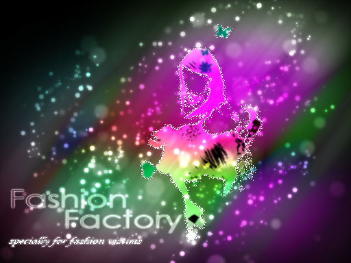
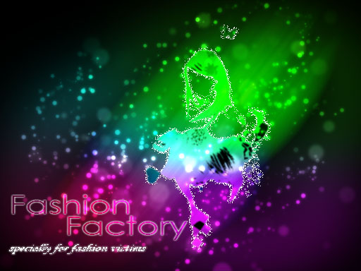
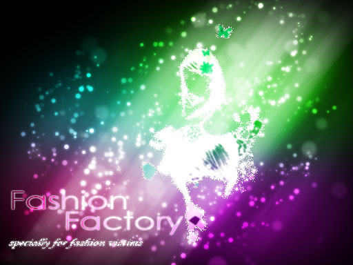
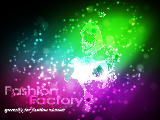
For different blending modes you get different outputs. Here are a few samples.





excuse me, but it is not good design it is not very comfortable for my eye, sorry but it is the truth at least for me try to improve your designs :), anyway good luck 🙂
Thank you for your comments and i shall improve my works.
i like the design up to step 6…it’s pretty, but a different picture could have been used towards the end. Thanks for this tutorial, i’m playing with it right now!
I am sure this is a nice tutorial if you used another image and maybe turn it around a bit more. I’ll see what I come up with using this tutorial and will give you credit 🙂
Thank you cindy, that was a nice idea, i will come up with a new style too.
I agree with the others, but I’m sure that you can improve your works 🙂
great design.
thanks to help me, i can apply your suggestion.